Unicode is supported everywhere, but font support for Unicode characters is sparse. When you use any slightly uncommon character, you have no guarantee someone else will be able to see it.
I’m starting a Twitter account @MusicTheoryTip and so I wanted to know whether I could count on followers seeing music symbols. I asked whether people could see ♭ (flat, U+266D), ♮ (natural, U+266E), and ♯ (sharp, U+266F). Most people could see all three symbols, from desktop or phone, browser or Twitter app. However, several were unable to see the natural sign from an Android phone, whether using a browser or a Twitter app. One person said none of the symbols show up on his Blackberry.
[Update: I gave @MusicTheoryTip over to someone else, and they didn’t keep it up for long.]
I also asked @diff_eq followers whether they could see the math symbols ∂ (partial, U+2202), Δ (Delta, U+0394), and ∇ (gradient, U+2207). One person said he couldn’t see the gradient symbol, but the rest of the feedback was positive.
So what characters can you count on nearly everyone being able to see? To answer this question, I looked at the characters in the intersection of several common fonts: Verdana, Georgia, Times New Roman, Arial, Courier New, and Droid Sans. My thought was that this would make a very conservative set of characters.
There are 585 characters supported by all the fonts listed above. Most of the characters with code points up to U+01FF are included. This range includes the code blocks for Basic Latin, Latin-1 Supplement, Latin Extended-A, and some of Latin Extended-B.
The rest of the characters in the intersection are Greek and Cyrillic letters and a few scattered symbols. Flat, natural, sharp, and gradient didn’t make the cut.
There are a dozen math symbols included:
0x2202 ∂
0x2206 ∆
0x220F ∏
0x2211 ∑
0x2212 −
0x221A √
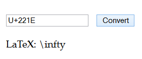
0x221E ∞
0x222B ∫
0x2248 ≈
0x2260 ≠
0x2264 ≤
0x2265 ≥
Interestingly, even in such a conservative set of characters, there are a three characters included for semantic distinction: the minus sign (i.e. not a hyphen), the difference operator (i.e. not the Greek letter Delta), and the summation operator (i.e. not the Greek letter Sigma).
And in case you’re interested, here’s the complete list of the Unicode characters in the intersection of the fonts listed here. (Update: Added notes to indicate the start of a new code block and listed some of the isolated characters.)
0x0009           Basic Latin
0x000d
0x0020 - 0x007e
0x00a0 - 0x017f  Latin-1 supplement
0x0192
0x01fa - 0x01ff
0x0218 - 0x0219
0x02c6 - 0x02c7
0x02c9
0x02d8 - 0x02dd
0x0300 - 0x0301
0x0384 - 0x038a  Greek and Coptic
0x038c
0x038e - 0x03a1
0x03a3 - 0x03ce
0x0401 - 0x040c
0x040e - 0x044f  Cyrillic
0x0451 - 0x045c
0x045e - 0x045f
0x0490 - 0x0491
0x1e80 - 0x1e85  Latin extended additional
0x1ef2 - 0x1ef3
0x200c - 0x200f  General punctuation
0x2013 - 0x2015
0x2017 - 0x201e
0x2020 - 0x2022
0x2026
0x2028 - 0x202e
0x2030
0x2032 - 0x2033
0x2039 - 0x203a
0x203c
0x2044
0x206a - 0x206f
0x207f
0x20a3 - 0x20a4  Currency symbols ₣ ₤
0x20a7           ₧
0x20ac           €
0x2105           Letterlike symbols ℅
0x2116           №
0x2122           ™
0x2126           Ω
0x212e           ℮
0x215b - 0x215e  ⅛ ⅜ ⅝ ⅞
0x2202 	         Mathematical operators ∂
0x2206           ∆
0x220f           ∏
0x2211 - 0x2212  ∑ −
0x221a           √
0x221e           ∞
0x222b           ∫
0x2248           ≈
0x2260           ≠
0x2264 - 0x2265  ≤ ≥
0x25ca           Box drawing ◊
0xfb01 - 0xfb02  Alphabetic presentation forms fi fl