Body roundness index

Body Roundness Index (BRI) is a proposed replacement for Body Mass Index (BMI) [1]. Some studies have found that BRI is a better measure of obesity and a more effective predictor of some of the things BMI is supposed to predict [2].

BMI is based on body mass and height, and so it cannot distinguish a body builder and an obese man if both have the same height and weight. BRI looks at body shape more than body mass.

The basic idea behind Body Roundness Index is to draw an ellipse based on a person’s body and report how close that ellipse is to being a circle. The more a person looks like a circle, higher his BRI. The formula for BRI is

BRI = 364.2 − 365.5 e

where e is the eccentricity of the ellipse.

Now what is this ellipse we’ve been talking about? It’s roughly an ellipse whose major axis runs from head to toe and whose minor axis runs across the person’s width.

There are a couple simplifications here.

  1. You don’t actually measure how wide someone is. You measure the circumference of their waist and find the diameter of a circle with that circumference.
  2. You don’t actually measure how high their waist is [3]. You assume their waist is at exactly half their height.

It’s conventional to describe an ellipse in terms of its semi-major axis a and semi-minor axis b. For a circle, a = b = radius. But in general an ellipse doesn’t have a single radius and a > b. You could think of a and b as being the maximum and minimum radii.

So to fit an ellipse to our idealized model of a person, the major axis, 2a, equals the person’s height.

a = h/2

The minor axis b is the radius of a circle of circumference c where c is the circumference of the person’s waist (or hips [3]).

b = c / 2π

As explained here, eccentricity is computed from a and b by


e = \sqrt{1 - \frac{b^2}{a^2}}

As an example, consider a man who is 6 foot (72 inches) tall and has a 34 inch waist. Then

a = 36
b = 17/π = 5.4112
e = √(1 − b²/a²) = 0.9886
BRI = 364.2 − 365.5 e = 2.8526

Note that the man’s weight doesn’t enter the calculation. He could be a slim guy weighing 180 pounds or a beefier guy weighing 250 pounds as long as he has a 34 inch waist. In the latter case, the extra mass is upper body muscle and not around his waist.

thin ellipse graph

Related posts

[1] Diana M. Thomas et al. Relationships Between Body Roundness with Body Fat and Visceral Adipose Tissue Emerging from a New Geometrical Model. Obesity (2013) 21, 2264–2271. doi:10.1002/oby.20408.

[2] Researchers argue over which number to reduce a person to: BMI, BRI, or some other measure. They implicitly agree that a person must be reduced to a number; they just disagree on which number.

[3] Or waist. There are two versions of BRI, one based on waist circumference and one based on hip circumference.

Radius of a stretched spring

When you stretch a coiled spring, the radius decreases slightly, so slightly that you can’t see the difference unless you stretch the spring so much that you damage it.

The math is essentially the same as in the previous post about wrapping Christmas lights around a tree trunk.

If you have a coiled spring of radius r, the points along the coil can be described by

(r cos t, r sin t, ht/2π)

where h is the spacing between turns. If t runs from 0 to T, the length of the spring is hT/2π and the length of the material in the spring, if it were uncoiled, would be

(r² + h²/4π²)1/2 T.

When we stretch a spring, we increase h. We don’t increase the total amount of material, so the radius must decrease, though not by much.

Suppose the spring initially has radius r1 and coil spacing h1. Then when we stretch it the spring has radius r2 and coil spacing h2. Since we haven’t created new material, we must have

(r1² + h1²/4π²)1/2 T = (r2² + h2²/4π²)1/2 T

and so

r1² + h1²/4π² = r2² + h2²/4π².

A small change in h results in a change in r an order of magnitude smaller, for reasons given in the previous post. Both posts boil down to the observation that for y small relative to x,

(x² + y²)1/2  x  = y² /2x + O(y4).

If we choose our units so that the initial radius is on the order of 1, then a change in length on the order of y results in a change in radius on the order of y².

Connecting the dots differently

A couple weeks ago I wrote about how H. A. Rey introduced a new way of looking at the constellations, making them look more like their names. That post used Leo as an example. This post looks at Boötes (The Herdsman) [1].

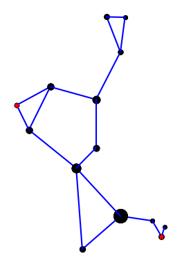
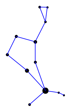
Here is the constellation using the connections indicated in the IAU star chart.

Bootes from IAU chart

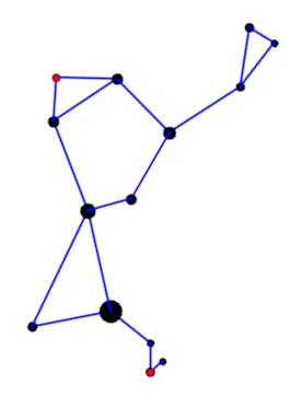
Here is the constellation using the connections drawn in Rey’s book [2].

H. A. Rey's version of Bootes

Rey’s version adds two stars, highlighted in red, but mostly connects the same stars in a different way. I suppose the herdsman is standing in the IAU version; it’s hard to tell. In Rey’s version, the huntsman is clearly seated and smoking a pipe. This is easier to see if we rotate the image a bit.

Rey's herdsman, rotated

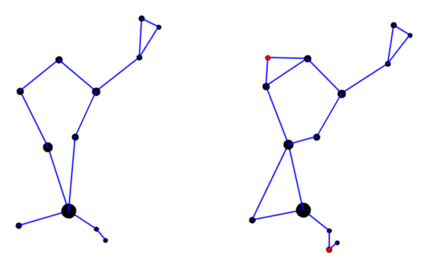
Here’s a comparison of the two interpretations side-by-side.

comparing both versions

Here is the Python code that produced the two images. It’s a little cleaner than the code in the earlier post, and it draws larger dots to represent brighter stars.

import matplotlib.pyplot as plt

# data from https://en.wikipedia.org/wiki/List_of_stars_in_Bo%C3%B6tes

α = (14 + 16/60, 19 + 11/60, 0.0)  
β = (15 +  2/60, 40 + 23/60, 3.5)  
γ = (14 + 32/60, 38 + 18/60, 3.0)  
δ = (15 + 16/60, 33 + 19/60, 3.5)  
ε = (14 + 45/60, 27 +  4/60, 2.3)  
ζ = (14 + 41/60, 13 + 44/60, 3.8)  
η = (13 + 55/60, 18 + 24/60, 4.5)  
θ = (14 + 25/60, 51 + 51/60, 4.0)  
κ = (14 + 13/60, 51 + 47/60, 4.5)  
λ = (14 + 16/60, 46 +  5/60, 4.2)
μ = (15 + 24/60, 37 + 23/60, 4.3)
υ = (13 + 49/60, 15 + 48/60, 4.0)  
τ = (13 + 47/60, 17 + 27/60, 4.5)  
ρ = (14 + 32/60, 30 + 22/60, 3.6)  
    
k = -15 # reverse and scale horizontal axis

def plot_star(s, m):
    plt.plot(k*s[0], s[1], m, markersize=14-2.2*s[2])    

def join(s0, s1, m='ko'):
    plot_star(s0, m)
    plot_star(s1, m)    
        
    plt.plot([k*s0[0], k*s1[0]], [s0[1], s1[1]], 'b-')    

def draw_iau():

    join(α, η)
    join(η, τ)
    join(α, ζ)
    join(α, ϵ)
    join(ϵ, δ)
    join(δ, β)
    join(β, γ)
    join(γ, λ)
    join(λ, θ)
    join(θ, κ)
    join(κ, λ)
    join(γ, ρ)
    join(ρ, α)

def draw_rey():

    join(α, η)
    join(η, υ)
    join(υ, τ)
    
    join(α, ζ)
    join(α, ϵ)
    join(ζ, ϵ)
    
    join(ϵ, δ)
    join(δ, β)
    join(δ, μ)
    join(μ, β)
    join(β, γ)
    join(γ, λ)
    join(λ, θ)
    join(θ, κ)
    join(κ, λ)
    join(γ, ρ)
    join(ρ, ϵ)

    plot_star(μ, 'r*')
    plot_star(υ, 'r*')        
    return

draw_iau()
plt.gca().set_aspect('equal')
plt.axis('off')
plt.savefig("bootes_iau.png")
plt.close()

draw_rey()
plt.gca().set_aspect('equal')
plt.axis('off')
plt.savefig("bootes_rey.png")
plt.close()

***

[1] The diaeresis over the second ‘o’ in Boötes means the two vowels are to be pronounced separately: bo-OH-tes. You may have seen the same pattern in Laocoön or oogenesis. The latter is written without a diaeresis now, but I bet authors used to write it with a diaeresis on the second ‘o’.

[2] H. A. Rey. The Stars: A New Way to See Them, Second Edition.

Plotting constellations

Suppose you wanted to write a program to plot constellations. This leads down some interesting rabbit trails.

When you look up data on stars in constellations you run into two meanings of constellation. For example, Leo is a region of the night sky containing an untold number of stars. It is also a pattern of nine particular stars connected by imaginary lines. It’s easier to find data on the former, say sorted by brightness.

Are the nine brightest stars in Leo-the-region the nine stars of Leo-the-stick-figure? Not exactly, but close.

Wikipedia has an article that list stars in each constellation region, and star charts that have constellations as stick figures. If the stars on the chart are labeled, you can cross reference them with Wikipedia.

On a particular star chart I have, the stars in Leo are labeled with their Bayer designation. Roughly speaking the Bayer designation labels the stars within a constellation with Greek letters in descending order of brightness, but there are inconsistencies. The nomenclature goes back to Johann Bayer (1572–1625) and has its flaws.

The stars in Leo, in line-drawing order, are

  1. δ Leo
  2. Denebola (β Leo)
  3. θ Leo
  4. Regulus (α Leo)
  5. η Leo
  6. γ Leo
  7. ζ Leo
  8. μ Leo
  9. ε Leo

You can look up the coordinates of these stars here. Line-drawing order does not correspond to brightness order, so without a labeled star chart you’d have some research to do. My chart labels all the stars in Leo (the stick figure), but not, for example, in Virgo.

γ Leo is actually two stars, and Wikipedia ranks the brightness of the stars a little differently than Bayer did, which is understandable since brightness could not be objectively measured in his day. Wikipedia also inserts a few stars in between the stars listed above.

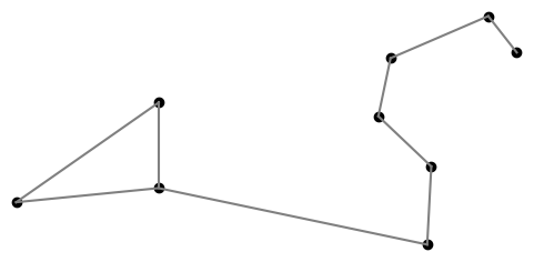
Here’s a plot of Leo using the data referenced above.

Helmholtz resonator revisited

We finished a bottle of wine this evening, and I blew across the top as I often do. (Don’t worry: I only do this at home. If we’re ever in a restaurant together, I won’t embarrass you by blowing across the neck of an empty bottle.)

The pitch sounded lower than I expected, so I revisited some calculations I did last year.

As I wrote about here, a wine bottle is approximately a Helmhotz resonator. The geometric approximation is not very good, but the pitch prediction usually is. An ideal Helmholtz resonator is a cylinder attached to a sphere, and a typical wine bottle is more like a cylinder attached to a larger cylinder. But the formula predicting pitch is robust to departures from ideal assumptions.

As noted before, the formula for the fundamental frequency of a Helmholtz resonator is

f = \frac{v}{2\pi} \sqrt{\frac{A}{LV}}

where the variables are as follows:

  • f, frequency in Hz
  • v, velocity of sound
  • A, area of the opening
  • L, length of the neck
  • V, volume

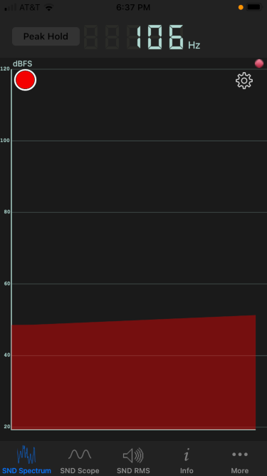
The opening diameter was 2 cm, the neck length 9 cm, and the volume 750 cm³. All these are typical. The predicted frequency is f = 118 Hz. The measured frequency was 106 Hz, measured by the Sonic Tools phone app.

The actual frequency was about 10% lower than predicted. This is about a whole step lower in musical terms. I could certainly hear an interval that large if I heard the two pitches sequentially. But I don’t have perfect pitch, and so I’m skeptical whether I could actually notice a pitch difference of that size from memory.

New Twitter account: ElementFact

I started a new Twitter account this morning: @ElementFact. I’m thinking the account will post things like scientific facts about each element but also some history around how the element was discovered and named and other lore associated with the element.

@ElementFact icon

We’ll see how this goes. I’ve started many Twitter accounts over the years. Some have taken off and some have not.

Six months ago I started @TensorFact as an experiment to see what would happen with a narrowly focused account. It did moderately well, but I ran out of ideas for content. This will be the last week for that account.

You can see a list of my current Twitter accounts here.

Koide’s coincidence

The p-norm of a vector is defined to be the pth root of the sum of its pth powers.

|| x ||_p = \left(\sum_{i=1}^n x_i^p\right )^{1/p}

Such norms occur frequently in application [1]. Yoshio Koide discovered in 1981 that if you take the masses of the electron, muon, and tau particles, the ratio of the 1 norm to the 1/2 norm is very nearly 2/3. Explicitly,

\frac{m_e + m_{\mu} + m_{\tau}}{(\sqrt{m_e}+\sqrt{m_{\mu}}+\sqrt{m_{\tau}})^2} \approx \frac{2}{3}

to at least four decimal places. Since the ratio is tantalizingly close to 2/3, some believe there’s something profound going on here and the value is exactly 2/3, but others believe it’s just a coincidence.

The value of 2/3 is interesting for two reasons. Obviously it’s a small integer ratio. But it’s also exactly the midpoint between the smallest and largest possible value. More on that below.

Is the value 2/3 within the measure error of the constants? We’ll investigate that with a little Python code.

Python code

The masses of particles are available in the physical_constants dictionary in scipy.constants. For each constant, the dictionary contains the best estimate of the value, the units, and the uncertainty (standard deviation) in the measurement [2].

    from scipy.constants import physical_constants as pc
    from scipy.stats import norm
    
    def pnorm(v, p):
        return sum(x**p for x in v)**(1/p)
    
    def f(v):
        return pnorm(v, 1) / pnorm(v, 0.5)
    
    m_e = pc["electron mass"]
    m_m = pc["muon mass"]
    m_t = pc["tau mass"]
    
    v0 = [m_e[0], m_m[0], m_t[0]]
    
    print(f(v0))

This says that the ratio of the 1 norm and 1/2 norm is 0.666658, slightly less than 2/3. Could the value be exactly 2/3 within the resolution of the measurements? How could we find out?

Measurement uncertainty

The function f above is minimized when its arguments are all equal, and maximized when its arguments are maximally unequal. To see this, note that f(1, 1, 1) = 1/3 and f(1, 0, 0) = 1. You can prove that those are indeed the minimum and maximum values. To see if we can make f larger, we want to increase the largest value, the mass of tau, and decrease the others. If we move each value one standard deviation in the desired direction, we get

    v1 = [m_e[0] - m_e[2], 
          m_m[0] - m_m[2], 
          m_t[0] + m_t[2]]
    print(f(v1))

which returns 0.6666674, just slightly bigger than 2/3. Since the value can be bigger than 2/3, and less than 2/3, the intermediate value theorem says there are values of the constants within one standard deviation of their mean for which we get exactly 2/3.

Now that we’ve shown that it’s possible to get a value above 2/3, how likely is it? We can do a simulation, assuming each measurement is normally distributed.

    N = 1000
    above = 0
    for _ in range(N):
        r_e = norm(m_e[0], m_e[2]).rvs()
        r_m = norm(m_m[0], m_m[2]).rvs()
        r_t = norm(m_t[0], m_t[2]).rvs()
        t = f([r_e, r_m, r_t])
        if t > 2/3:
            above += 1
    print(above)

When we I ran this, I got 168 values above 2/3 and the rest below. So based solely on our calculations here, not taking into account any other information that may be important, it’s plausible that Koide’s ratio is exactly 2/3.

***

[1] Strictly speaking, we should take the absolute values of the vector components. Since we’re talking about masses here, I simplified slightly by assuming the components are non-negative.

Also, what I’m calling the p “norm” is only a norm if p is at least 1. Values of p less than 1 do occur in application, even though the functions they define are not norms. I’m pretty sure I’ve blogged about such an application, but I haven’t found the post.

[2] The SciPy library obtained its values for the constants and their uncertainties from the CODATA recommended values, published in 2014.

Linear regression and planet spacing

A while back I wrote about how planets are evenly spaced on a log scale. I made a bunch of plots, based on our solar system and the extrasolar systems with the most planets, and said noted that they’re all roughly straight lines. Here’s the plot for our solar system, including dwarf planets, with distance on a logarithmic scale.

Distances in our solar system including planets and dwarf planets

This post is a quick follow up to that one. You can quantify how straight the lines are by using linear regression and comparing the actual spacing with the spacing given by the best straight line. Here I’m regressing the log of the distance of each planet from its star on the planet’s ordinal position.

NB: I am only using regression output as a measure of goodness of fit. I am not interpreting anything as a probability.

|-----------+-----------+----------+-----------|
| System    | Adjusted  | Slope    | Intercept |
|           | R-squared | p-value  | p-value   |
|-----------+-----------+----------+-----------|
| home      |    0.9943 | 1.29e-11 |  2.84e-08 |
| kepler90  |    0.9571 | 1.58e-05 |  1.29e-06 |
| hd10180   |    0.9655 | 1.41e-06 |  2.03e-07 |
| hr8832    |    0.9444 | 1.60e-04 |  5.57e-05 |
| trappist1 |    0.9932 | 8.30e-07 |  1.09e-09 |
| kepler11  |    0.9530 | 5.38e-04 |  2.00e-05 |
| hd40307   |    0.9691 | 2.30e-04 |  1.77e-05 |
| kepler20  |    0.9939 | 8.83e-06 |  3.36e-07 |
| hd34445   |    0.9679 | 2.50e-04 |  4.64e-04 |
|-----------+-----------+----------+-----------|

R² is typically interpreted as how much of the variation in the data is explained by the model. In the table above, the smallest value of R² is 94%.

p-values are commonly, and wrongly, understood to be the probability of a model assumption being incorrect. As I said above, I’m completely avoiding any interpretation of p-values as the probability of anything, only noting that small values are consistent with a good fit.

Journals commonly, and wrongly, are willing to assume that anything with a p-value less than 0.05 is probably true. Some are saying the cutoff should be 0.005. There are problems with using any p-value cutoff, but I don’t want to get into here. I’m only saying that small p-values are typically seen as evidence that a model fits, and the values above are orders of magnitude smaller than what journals consider acceptable evidence.

When I posted my article about planet spacing I got some heated feedback saying that this isn’t exact, that it’s unscientific, etc. I thought that was strange. I never said it was exact, only that it was a rough pattern. And although it’s not exact, it would be hard to find empirical studies of anything with such a good fit. If you held economics or psychology, for example, to the same standards of evidence, there wouldn’t be much left.

This pattern is known as the Titius-Bode law. I stumbled on it by making some plots. I assumed from the beginning that someone else must have done the same exercise and that the pattern had a name, but I didn’t know that name until later.

Someone sent me a paper that analyzes the data on extrasolar planets and Bode’s law, something much more sophisticated than the crude sketch above, but unfortunately I can’t find it this morning. I don’t recall what they did. Maybe they fit a hierarchical model where each system has its own slope and intercept.

One criticism has been that by regressing against planet order, you automatically get a monotone function. That’s true, but you do get a much better fit on a log scale than on a linear scale in any case. You might look at just the relative planet spacings without reference to order.

Proving life exists on Earth

NASA’s Galileo mission was primarily designed to explore Jupiter and its moons. In 1989, the Galileo probe started out traveling away from Jupiter in order to do a gravity assist swing around Venus. About a year later it also did a gravity assist maneuver around Earth. Carl Sagan suggested that when passing Earth, the Galileo probe should turn its sensors on Earth to look for signs of life. [1]

Artist conception of Galileo probe surveying Jupiter and its moons

Now obviously we know there’s life on Earth. But if we’re going look for life on other planets, it’s reasonable to ask that our methods return positive results when examining the one planet we know for sure does host life. So scientists looked at the data from Galileo as if it were coming from another planet to see what patterns in the data might indicate life.

I’ve started using looking for life on Earth as a metaphor. I’m working on a project right now where I’m looking for a needle in a haystack, or rather another needle in a haystack: I knew that one needle existed before I got started. So I want to make sure that my search procedure at least finds the one positive result I already know exists. I explained to a colleague that we need to make sure we can at least find life on Earth.

This reminds me of simulation work. You make up a scenario and treat it as the state of nature. Then pretend you don’t know that state, and see how successful your method is at discovering that state. It’s sort of a schizophrenic way of thinking, pretending that half of your brain doesn’t know what the other half is doing.

It also reminds me of software testing. The most trivial tests can be surprisingly effective at finding bugs. So you write a few tests to confirm that there’s life on Earth.

Related posts

[1] I found out about Galileo’s Earth reconnaissance listening to the latest episode of the .NET Rocks! podcast.

Planets evenly spaced on log scale

The previous post was about Kepler’s observation that the planets were spaced out around the sun the same way that nested regular solids would be. Kepler only knew of six planets, which was very convenient because there are only five regular solids. In fact, Kepler thought there could only be six planets because there are only five regular solids.

The distances to each of the planets is roughly a geometric series. Ratios of consecutive distances are between 1.3 and 3.4. That means the distances should be fairly evenly spaced on a logarithmic scale. The plot below shows that this is the case.

Distance to planets in our solar system on log scale

The plot goes beyond the six planets known in Kepler’s day and adds four more: Uranus, Neptune, Pluto, and Eris. Here I’m counting the two largest Kuiper belt objects as planets. Distances are measured in astronomical units, i.e. Earth = 1.

Update: The fit is even better if we include Ceres, the largest object in the asteroid belt. It’s now called a dwarf planet, but it was considered a planet for the first fifty years after it was discovered.

Distances in our solar system including planets and dwarf planets

Extrasolar planets

Is this just true of our solar system, or is it true of other planetary systems as well? At the time of writing, we know of one planetary system outside our own that has 8 planets. Three other systems have around 7 planets; I say “around” because it depends on whether you include unconfirmed planets. The spacing between planets in these other systems is also fairly even on a logarithmic scale. Data on planet distances is taken from each system’s Wikipedia page. Distances are semimajor axes, not average distances.

This post just shows plots. See this follow up post for regression results.

Kepler-90

Kepler-90 is the only planetary system outside our own with eight confirmed planets that we know of.

Distances to planets in Kepler-90 system

HD 10180

HD 10180 has seven confirmed planets and two unconfirmed planets. The unconfirmed planets are included below, the 3rd and 6th objects.

Distances to planets in HD 10180 system

HR 8832

The next largest system is HR 8832 with five confirmed planets and two unconfirmed, numbers 5 and 6 below. It would work out well for this post if the 6th object were found to be a little closer to its star.

Distances to planets in HR 8832 system

TRAPPIST-1

TRAPPIST-1 is interesting because the planets are very close to their star, ranging from 0.01 to 0.06 AU. Also, this system follows an even logarithmic spacing more than the others.

Distances to planets in TRAPPIST-1 system

Systems with six planets

There are currently four known systems with four planets: Kepler-11, Kepler-20, HD 40307, and HD 34445. They also appear to have planets evenly spaced on a log scale.

Distances between planets in known systems with six planets

Like TRAPPIST-1, Kepler-20 has planets closer in and more evenly spaced (on a log scale).

More astronomy posts