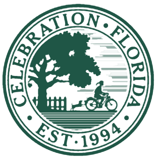
One of the case studies in Michael Beirut’s book How to is the graphic design for the planned community Celebration, Florida. The logo for the town’s golf course is an illustration of the bike shed principle.
C. Northcote Parkinson observed that it is easier for a committee to approve a nuclear power plant than a bicycle shed. Nuclear power plants are complex, and no one on a committee presumes to understand every detail. Committee members must rely on the judgment of others. But everyone understands bicycle sheds. Also, questions such as what color to paint the bike shed don’t have objective answers. And so bike sheds provoke long discussions.
People argue about bike sheds because they understand bike sheds. Beirut said something similar about the Celebration Golf Club logo which features a silhouette of a golfer.
Designing the graphics for Celebration’s public golf club was much harder than designing the town seal. It took me some time to realize why: none of our clients were Schwinn-riding, polytailed girls [as in the town seal], but most of them were enthusiastic golfers. The silhouette on the golf club design was refined endlessly as various executives demonstrated their swings in client meetings.
Image credit: By Source, Fair use, https://en.wikipedia.org/w/index.php?curid=37643922

Several years ago, I was on the committee of an organisation which had just decided to provide delegates’ packs for those attending our Annual Conference.
The question turned to the pencils to be included. Should they be round or hexagonal in cross-section? Green or blue? Have an eraser or not? Which hardness should they have? Have our web address or not? Everyone wanted something different, and no-one was willing to give way.
The debate went on and on for over a week, and was only resolved when the Vice Chairman got so fed up that he just went out and bought a few gross of what he wanted.